As we look ahead to 2025, color trends in design are evolving to reflect our changing world, technological advancements, and shifting cultural values. From AI-influenced palettes to climate-conscious hues, these emerging color trends will shape the visual landscape across digital interfaces, product design, fashion, and architecture. Here's our forecast of the five most influential color trends that will dominate in 2025.
1. Regenerative Earth Tones
In response to the growing climate consciousness and sustainability movement, regenerative earth tones will take center stage in 2025. These colors go beyond the muted, passive earth tones of previous years to embrace richer, more vibrant natural hues that symbolize environmental renewal and regeneration.
These colors will be particularly prominent in:
- Sustainable product design - packaging, eco-friendly consumer goods, and renewable energy products
- Architecture and interior design - biophilic spaces that connect occupants with nature
- Fashion - brands emphasizing environmental responsibility and natural materials
- Digital interfaces - apps and platforms focused on sustainability, wellness, and outdoor activities
The regenerative earth palette represents more than aesthetic preference—it signals a commitment to environmental stewardship and planetary health. Brands adopting these colors communicate their alignment with values increasingly important to consumers.
2. Digital Wellness Blues
As digital fatigue continues to be a concern, a new palette of calming yet optimistic blues will emerge to create more humane digital experiences. These "Digital Wellness Blues" balance the technical associations of blue with softer, more organic qualities.
This trend responds to research showing the impact of color on digital well-being and cognitive load. The Digital Wellness Blues palette aims to:
- Reduce eye strain and screen fatigue
- Create a sense of calm and focus in digital environments
- Signal trustworthiness and reliability while avoiding coldness
- Balance technological precision with human warmth
We'll see these colors implemented in:
- UI/UX design - particularly in productivity apps, health platforms, and digital learning environments
- Smart home interfaces - creating ambient technology experiences that feel less intrusive
- Virtual and augmented reality - establishing comfortable digital spaces for extended use
"The blues of 2025 aren't about melancholy or corporate sterility—they're about creating digital environments where humans can thrive. These colors acknowledge our technological reality while prioritizing our psychological needs."
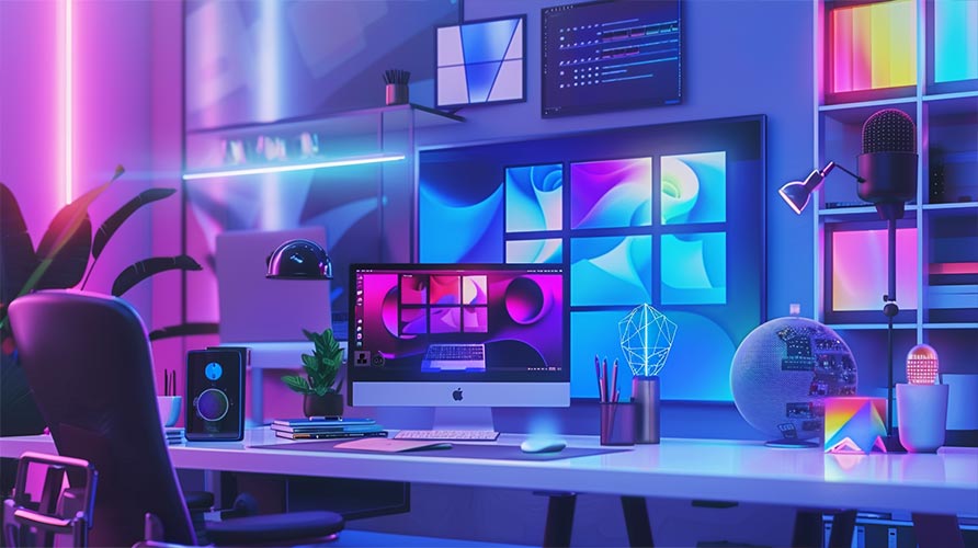
3. AI-Generated Gradients
As artificial intelligence continues to influence design, we'll see the rise of complex, AI-generated color gradients that would be difficult for humans to conceptualize independently. These gradients feature unexpected color transitions, subtle variations, and mathematically precise relationships between hues.
These AI-generated gradients will be characterized by:
- Hypnotic transitions between seemingly incompatible colors
- Micro-variations that create depth and dimension
- Color relationships based on mathematical patterns rather than traditional color theory
- Dynamic adaptability to different contexts and lighting conditions
We'll see these gradients applied in:
- Brand identities for tech-forward companies
- Digital product interfaces, particularly those leveraging AI capabilities
- Generative art and NFTs
- Immersive experiences in both physical and digital environments
This trend reflects our evolving relationship with AI—from viewing it as a tool to seeing it as a creative collaborator with unique aesthetic sensibilities.
4. Adaptive Chromatics
As responsive and context-aware technology becomes more sophisticated, we'll see the rise of "Adaptive Chromatics"—color palettes that dynamically shift based on user behavior, environmental conditions, time of day, or data inputs.
Unlike static color schemes, Adaptive Chromatics represent a system-based approach to color that can:
- Adjust to ambient lighting conditions for optimal visibility
- Respond to user preferences and accessibility needs
- Shift based on usage patterns and cognitive load
- Visualize data through subtle color variations
- Create personalized experiences that evolve over time
This trend will manifest in:
- Smart device interfaces that adjust colors based on time of day and user activity
- Architectural lighting that responds to occupancy and environmental factors
- Wearable technology with displays that adapt to different contexts
- Data visualization that uses color shifts to represent changing information
Adaptive Chromatics represents a shift from thinking about color as fixed to understanding it as responsive and intelligent—a reflection of our increasingly dynamic relationship with technology.
5. Nostalgic Futurism
In 2025, we'll see a color trend that paradoxically combines retrofuturistic elements with contemporary sensibilities. "Nostalgic Futurism" draws inspiration from past visions of the future—from 1980s cyberpunk to Y2K aesthetics to early digital interfaces—but reinterprets them through a modern lens.
This palette combines:
- Saturated neons reminiscent of early digital aesthetics
- Muted technological grays and blues from vintage computing
- The optimistic brights of Y2K-era design
- Contemporary refinements that make these references subtle rather than literal
Nostalgic Futurism reflects our complex relationship with technology and progress—simultaneously looking forward and backward, combining optimism with a touch of irony. It acknowledges that our visions of the future are always shaped by the past.
We'll see this trend in:
- Gaming aesthetics and virtual environments
- Fashion and consumer products targeting digitally-native generations
- Motion graphics and video content
- Brand refreshes for companies looking to balance innovation with heritage
How to Apply These Trends in Your Design Work
As you consider incorporating these color trends into your projects, keep these principles in mind:
Context is Key
Not every trend is appropriate for every application. Consider your audience, brand values, and functional requirements before adopting a trend. For example:
- Regenerative Earth Tones may be perfect for sustainable brands but could feel inauthentic for cutting-edge tech products
- AI-Generated Gradients might work well for forward-thinking startups but could alienate users of traditional financial services
Balance Trend with Timelessness
The most effective color applications combine trendy elements with enduring principles of color theory and brand consistency. Consider:
- Using trend colors as accents within a more established palette
- Ensuring that trend colors still align with your brand's core values and personality
- Testing how trend colors perform across different contexts and applications
Accessibility Remains Essential
As color trends evolve, accessibility considerations remain constant. Always ensure that:
- Text maintains sufficient contrast against backgrounds
- Important information isn't conveyed through color alone
- Designs remain usable for people with various forms of color vision deficiency
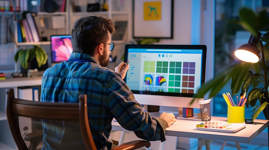
Use Tools Like ColorTouch AI
AI-powered color tools can help you work effectively with these emerging trends:
- Extract trend-aligned colors from reference images
- Generate accessible color combinations within trend parameters
- Test how trend colors perform across different applications
- Create custom variations of trend palettes that align with your brand
Conclusion
The color trends of 2025 reflect our evolving relationship with technology, nature, and our own history. From the environmentally-conscious Regenerative Earth Tones to the technologically sophisticated AI-Generated Gradients, these trends offer designers a rich palette of options for creating relevant, engaging visual experiences.
As with any trend forecast, these predictions represent emerging directions rather than absolute rules. The most successful designers will understand these trends as starting points for exploration rather than formulas to follow rigidly.
By thoughtfully incorporating these color trends into your work—with attention to context, accessibility, and brand alignment—you can create designs that feel both of-the-moment and authentic to your unique vision.